181
Recommended Fonts for Programming?
14 Answers
196
Either Consolas (download) or Andale Mono (download). I mostly use Andale Mono. I wrote an article about programming fonts a long time ago, I think Consolas wasn't even out yet.
http://www.deadprogrammer.com/photos/fonts.gif
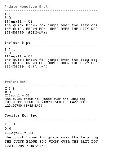
I find that typing Illegal1 = O0 is a good test of suitability.
8
6
I think the anti-aliasing blur on Consolas is caused by monitors which do not have ClearType enabled. Consolas was designed for ClearType.
[Jeff A: indeed, you can see screenshots of this in a post I wrote on this topic.]
2
Until I found ProggyTiny, I always made my own fonts using Softy. It's surprisingly easy, and might increase your productivity if you're annoyed by some features of your current font (like "Q is too similiar to 0").
2
I use MonteCarlo, which is based on ProFont but has a bold face too. That way IDEs/editors that use bold as part of their syntax highlighting leave your text still properly fixed width.
java example http://bok.net.nyud.net/MonteCarlo/images/java-example.png quick brown fox example http://bok.net.nyud.net/MonteCarlo/images/screenshot-small.gif


Like ProFont, Proggy & others, its quite small (& being bitmap based, obviously doesn't scale), but I like a small font for coding and its still extremely clear and easy on the eyes.
1
For quite some time I've been using ProFont, mainly because it allows a lot of lines fit into a given height (a lot more than say Consolas or others). Consolas is not bad either, though...
1
I never considered changing my font, I have always been happy with Courier. This thread has truely opened my eyes, if only I could upvote it!
Went with Droid Sans Mono.
1
Consolas, works great for various font sizes, and I can't find anything better.
0
I'd also have to add another vote for Android's "Droid Sans Mono". It's a very crisp, clear coding font.
0
I experimented with Myriad until I realised using a variable-width font was a fools game.
Courier New here, although I am going to try out Envy after seeing it here.
0
It must be noted that the text editor/IDE that you use determines how good a font will look. I love UltraEdit, but the only font it renders properly is Courier New. It blurs out about all other useful monospace fonts. However, Visual Studio does a great job rendering any font accurately.
Currently, I will vote Consolas. Though, I will try some of the others listed in the responses. Thank you. Btw, please post links to download!
0
I recommend Lucida Console for Windows users and Adobe Courier for Linux/Unix, with a size of 10pt these fonts looks great! and very legible
Edit:
I've been saying that using Lucida Console was a real good option, well, now I know Consolas :)
0
bitstream vera sans mono
0
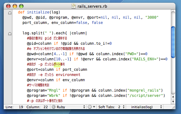
I use ForMateKonaVe, which is a merge of Bitstream Vera Sans Mono and a half-width'd Konatsu. I use a lot of Japanese here and there and this is the best way to display it in TextMate.