How to Design for Color Blindness
Choose contrasting colors for text and backgrounds.. Pick color combinations like blue/yellow and orange/purple.. Stay away from green/red, green/brown, and blue/purple.
Steps
1
Choose contrasting colors for text and backgrounds.
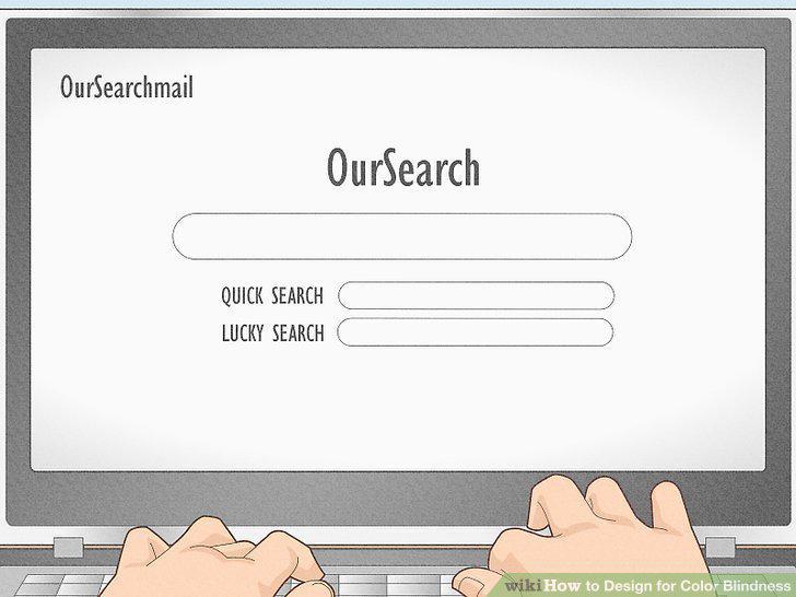
Choose contrasting colors for text and backgrounds.
2
Pick color combinations like blue/yellow and orange/purple.
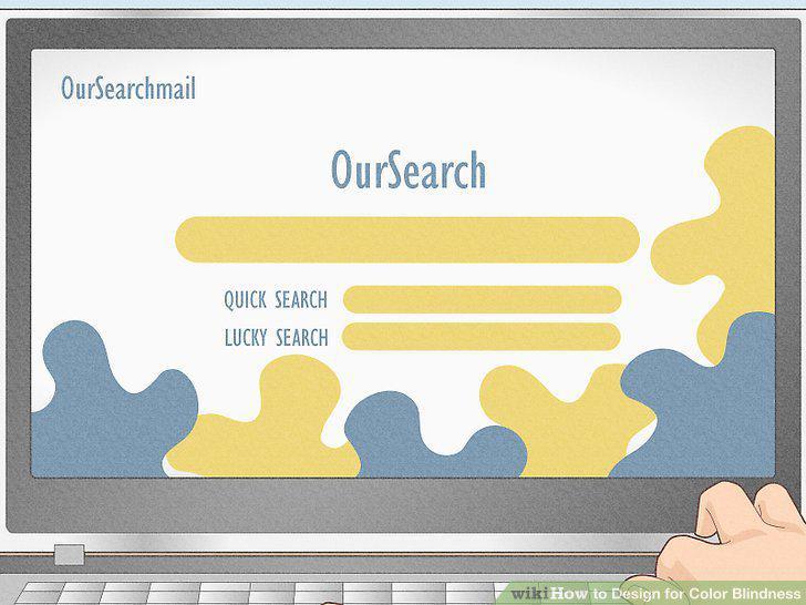
Pick color combinations like blue/yellow and orange/purple.
3
Stay away from green/red, green/brown, and blue/purple.
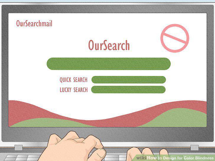
Stay away from green/red, green/brown, and blue/purple.
4
Use bright, bold colors.
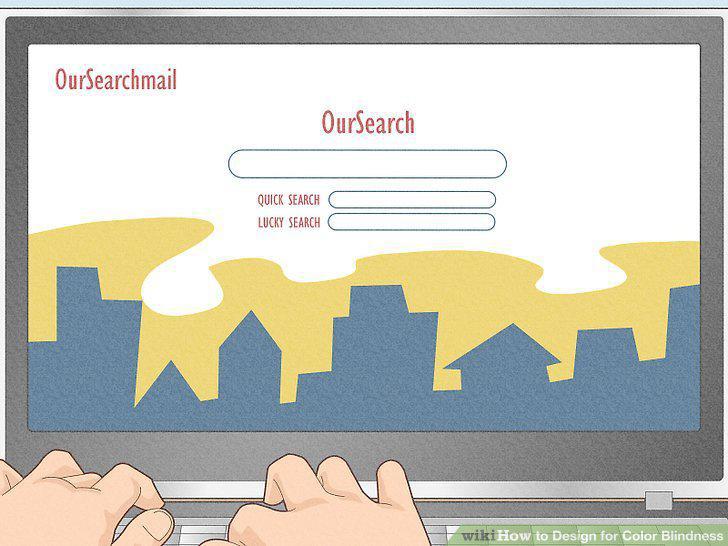
Use bright, bold colors.
5
Keep your color palette minimal.
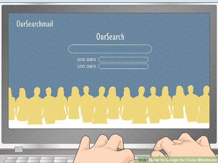
Keep your color palette minimal.
6
Underline clickable links.
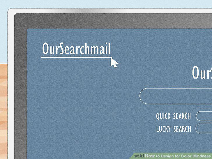
Underline clickable links.
7
Include symbols and keys.
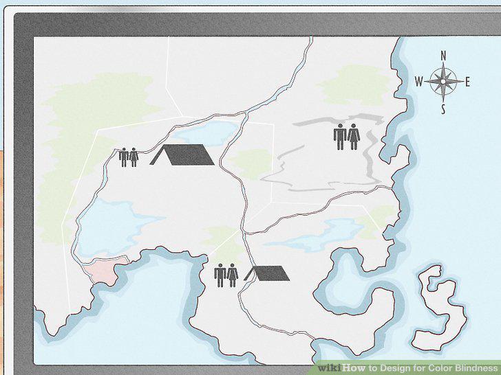
Include symbols and keys.
8
Add texture to maps, charts, and graphs.
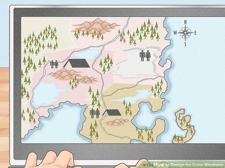
Add texture to maps, charts, and graphs.
9
Outline sections on maps.
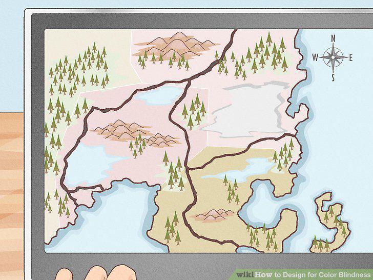
Outline sections on maps.
10
Label information without using colors.
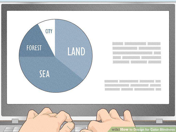
Label information without using colors.
Comments (0)
No comments yet. Be the first to share your thoughts!