How to Make a Website Responsive
Find out how your audience uses your website.. Design different layouts for different devices.. Account for different types of interactions.
Steps
Find out how your audience uses your website.
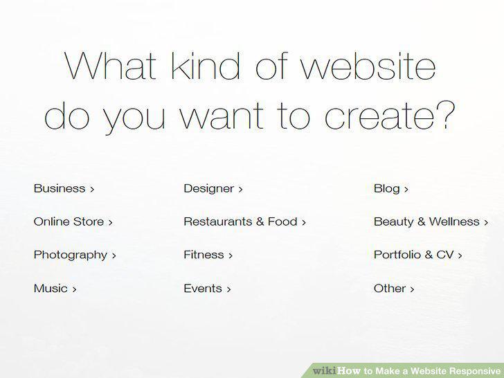
Find out how your audience uses your website.
Design different layouts for different devices.
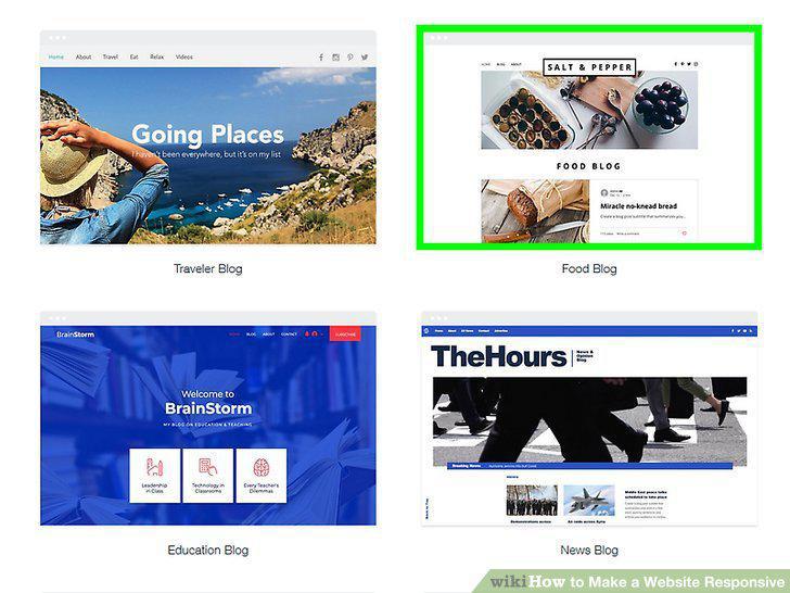
Design different layouts for different devices.
Account for different types of interactions.
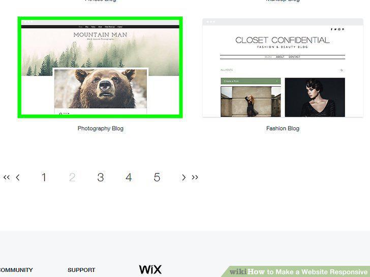
Account for different types of interactions.
Consider using a Content Management System (CMS).

Consider using a Content Management System (CMS).
Use online tools to test your website.
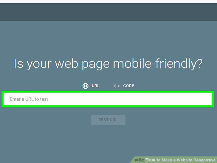
Use online tools to test your website.
Consider a free responsive style sheet framework.
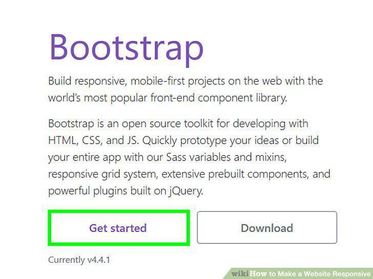
Consider a free responsive style sheet framework.
Set the viewport with a meta tag.
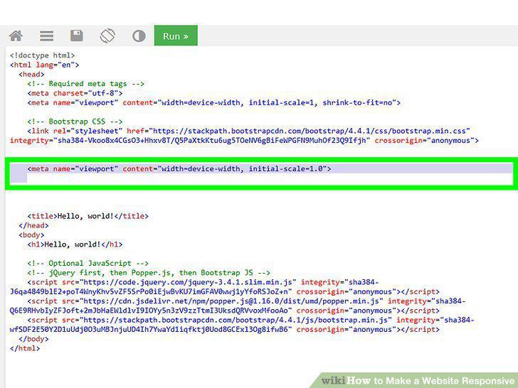
Set the viewport with a meta tag.
Specify the text size in relation to the viewport.
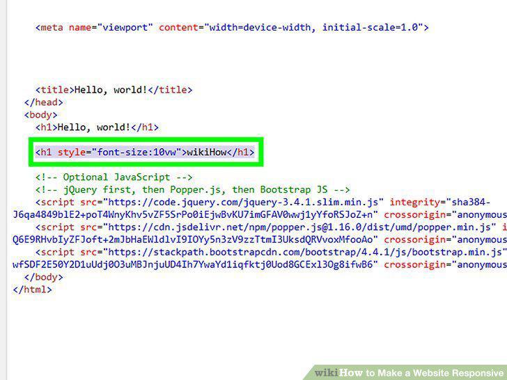
Specify the text size in relation to the viewport.
Use media queries to show different styles for different screen sizes.
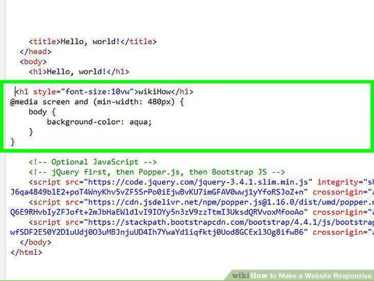
Use media queries to show different styles for different screen sizes.
Use the CSS width property to scale images.
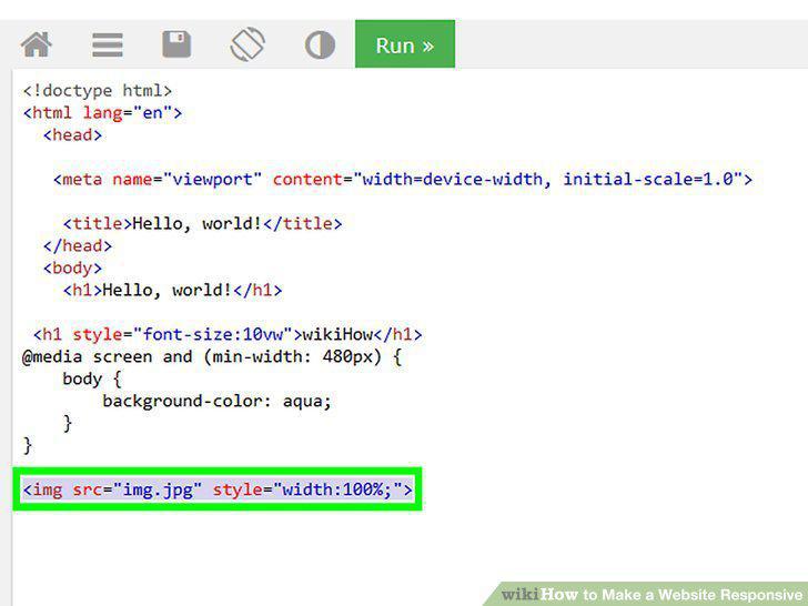
Use the CSS width property to scale images.
Use the max-width property to limit scaling the image's actual size.
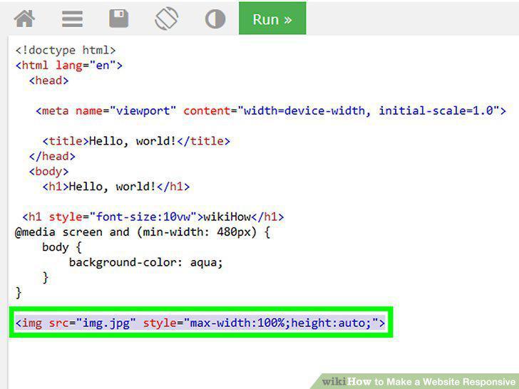
Use the max-width property to limit scaling the image's actual size.
Use the HTML picture element to display different images on different screen siz
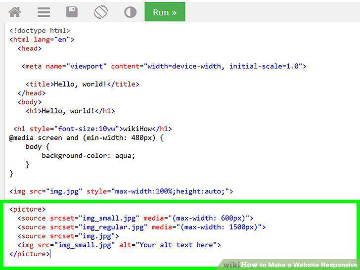
Use the HTML picture element to display different images on different screen sizes.
Comments (0)
No comments yet. Be the first to share your thoughts!